Construction and design
Choosing a roof colour to suit the façade, windows and setting
First decide which elements of the house will stay unchanged, then match the roof colour to them. In a renovation this may be the brickwork, a stone plinth or the windows; for a new house, prepare a shared set of samples. Check the shade, gloss and texture of the coating in daylight, in sun and shade, and on a formed profile rather than a flat swatch. View the house from the distance it will most often be seen from, and compare the gutter, flashings and soffit. This approach avoids an accidental mix of similar greys or browns.
Which element should the colour scheme start with?
It is best to start with the materials you do not plan to change. In a renovation, this may be the brick on the façade, a stone plinth or the joinery. The roof should work with these elements. For a new house, it is worth preparing a shared set of samples. Choosing subsequent colours separately often leads to an accidental combination of several different shades of grey or brown.
The surroundings also matter. A large dark roof surface looks different in dense development than on an open plot among greenery. It is worth viewing the house from the distance from which it will most often be seen. The roof is an extensive surface, so its colour can dominate the details. What seems calm on a small sample is often much stronger on the whole building volume.
When does graphite, brown or brick red work?
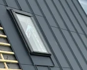
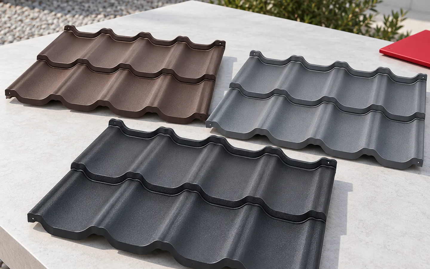
Graphite is easy to combine with a light façade and simple joinery. It can emphasise a modern form, but it is not reserved only for that. Brown often harmonises with warm render and natural materials. Brick shades give a more distinct, traditional accent. The final effect, however, depends on the colour temperature, gloss and scale of the roof surface.
It is not worth judging a combination by the colour name alone. Two browns can have different red or grey tones. Similarly, graphite can look warmer or cooler. The sample should be placed next to the actual façade in daylight. It is best to check it in sun and shade, because both conditions will occur on the building for most of the year.
How do gloss and profile change the perception of colour?
A glossy surface reflects light more strongly and may show contrasts more clearly. Matt gives a calmer effect, but it also depends on the type of texture. One should not assume that matt always means higher durability. The protective properties come from the specific coating. Appearance is one characteristic, and resistance to the environment and radiation is another.
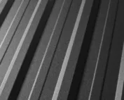
Tile-effect metal roofing (blachodachówka) creates light and shadow on the waves and transverse steps. T18 and T35 run lines along the roof surface, so the same colour can look different. A higher profile gives a stronger pattern. It is worth viewing a sample of the formed material, not just a flat swatch. A photo on a screen is also not a reliable reference, because it depends on the display settings and lighting.

Do gutters and flashings have to be exactly the same colour?
A uniform colour calms the roof line and reduces the number of visible divisions. Contrast can emphasise the eaves or the form of the building volume, if intended. Consistency is important, not the obligation to use one colour everywhere. It is worth assessing the gutter, the gutter apron, the chimney flashing and the soffit together. Each of these elements is visible from a different angle.
Even with the same designation, the shade may differ in texture, gloss or production batch. It is therefore advisable to order the complete set of materials with an agreed specification. Do not buy random flashings based solely on the name grey. Particularly at the junction of large surfaces, a small difference can be noticeable. A sample helps to check this before installation.
What does colour change in terms of temperature and maintenance?
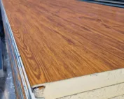
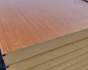
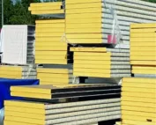
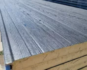
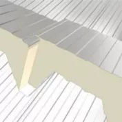
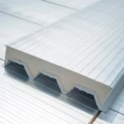
Dark surfaces generally heat up more in the sun than light ones with comparable characteristics. The covering and its fixing must allow for dimensional change. In sandwich panels, the choice of dark colours may affect the support and installation conditions. Do not transfer the colour freedom of a small flashing to a panel of any length.
Colour also affects the visibility of dust, streaks and deposits. Light steel sheet may show dirt more strongly, while dark may show traces of hard water or light dust. This does not mean that either colour requires aggressive cleaning. Cleaning should follow the coating instructions. The ventilation and insulation arrangement remains important regardless of the chosen shade.
How do you make the final decision?
Prepare a few samples instead of a dozen similar visualisations. Combine them with the façade, window and gutter. View the chosen profile on a finished roof of a similar scale. Check the availability of the complete set of accessories and any local regulations concerning the building’s appearance. This way the decision will not be based solely on a photo found on the internet.
In the order, record the colour, type of coating and decorative side. This also applies to steel sheet visible from below in a gazebo or shelter. A well-chosen colour should suit the house for a long time, not just a passing fashion. The best effect comes from a calm set of materials and precise execution of the edges, which tidy the appearance of the whole roof.
7 branches. Materials closer to your project.